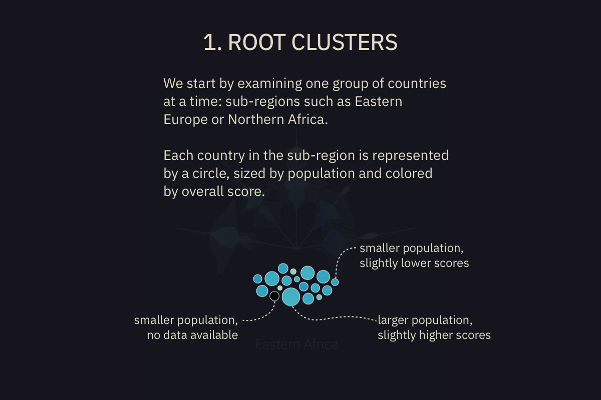
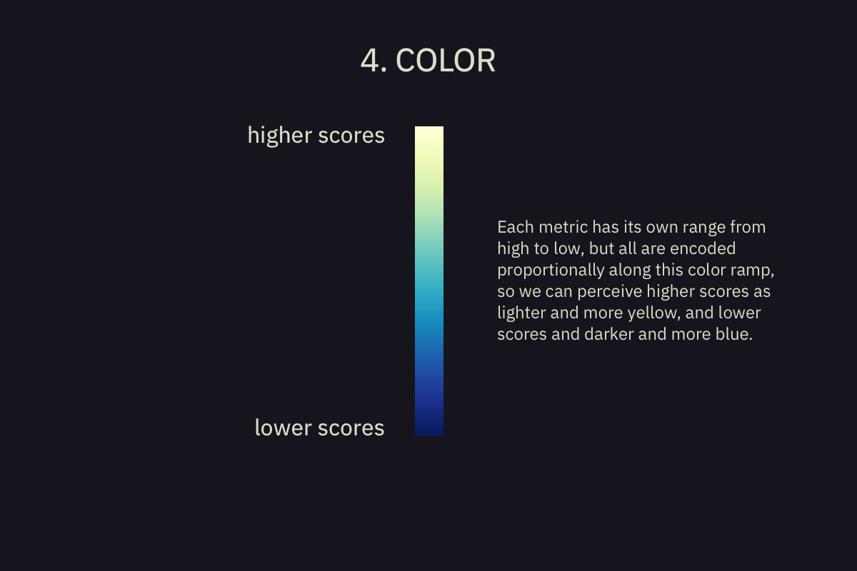
how to read
How to read


Nations in Bloom
How are countries around the world measuring along dimensions such as sustainable wellbeing, health and life expectancy, education, freedom, governance, public safety, and distribution of income?
By observing per-country scores in five publicly available indices, and grouping countries into geographic regions and subregions, the following charts give us a view into how countries are faring, and how they compare to others around the world.
The World Government Summit provided a visualization challenge and data containing measurements of many aspects of countries. Here we examine five of them:
- GINI Index
- Happy Planet Index
- Human Development Index
- World Happiness Report Score
- Sustainable Economic Development Assessment
Africa
Africa is a massive continent containing 54 countries, divided here into 5 sub-regions. Most regions tend toward mid to low scores on most metrics, shown by bluer shapes more towards the center of the petals. Central Africa scores quite low in the Sustainable Economic Development Assessment, while Northern and Eastern Africa have countries with fairly high scores in the Human Development Index.
Europe
The region with the highest scores, Europe shows an amalgamation of its countries around strong performance across all indicators, as seen by the lighter colors and petal shapes further out from the center. Northern and Western Europe emerge as clear leaders across the attributes, most notably the Human Development Index. But Southern Europe is the frontrunner of the Happy Planet Index - which is a trend we can see in some other continents as well, mostly driven by the smaller size of ecological damage related to their sustainable development efforts.
Asia
Asia contains the two most populous nations on Earth, China and India. Between those and the geographic range that includes five sub-regions, Asia is the largest population of the geographic regions. Three of the metrics have a fairly wide distribution of scores, so the petals are longer and thinner. Visible from the pale yellow brightness of its petals, Western Asia (largely, known also as the Middle East) has the highest indicators, apart from the Happy Planet Index, for which South-Eastern Asia takes the trophy. The World Happiness Report Score has a bell shape showing a large concentration of middle scores, and the GINI Index - as in all regions - is even more tightly clustered. The one country with no data available is North Korea.
The Americas
In the Americas the World Happiness Report Score is concentrated just above the middle of the range, due mostly to Central and South America's populations and scores. The Human Development index has two clusters: a small pocket of very high scores from North America, and a larger group of fairly high scores from all other countries. North America (the United States and Canada) performs well but strickingly occupies the lowest portion of the Happy Planet Index scores for the Americas. The GINI index - measuring equality in the distribution of income - of all regions lingers around mid to low levels.
Oceania
The region with the smallest population by far, Oceania includes Australia, New Zealand, Papua New Guniea and many South Pacific island nations. Because the size of the petal shapes is based on a global scale, they appear here as a series of small bumps along the line where scores show up. This is the region with the least data available across all the metrics. Perhaps expectedly, Australia and New Zealand have the majority of the best indicators - of the GINI index petal, the Human Development petal, and the Sustainable Economic Development Assessment petal. Just as we’ve observed above with some other wealthy Western regions, on the Happy Planet Index petal they do not rank highly. According to the Happy Planet Index methodology, this can be attributed to the sustainable way some smaller countries are achieving their wellbeing - especially with much smaller ecological damage.